There are many benefits to effective reporting including increased communication, improved efficiency and business decision making, and identifying problems within the prevention- mitigation timeframe. Rutgers faculty and staff can utilize our Reporting & Dashboards services to transform how they perform everyday tasks and transform their ideas into actionable insights.


Dashboard Toolkit

OIT-EAS developers have put together a few business cases and dashboards to showcase what ways data visuals can be utilized. The data behind these dashboards have been created for the purposes of demonstration.

Under each business case, it’s asked “WHO” is it for? “WHAT” is it? “WHY” should we use it?

Freshmen Retention Overall

This example is using a Sankey diagram. This diagram is an interactive way to show movement of our students. 

WHO: University administrators & School leadership

WHAT: Retention information and out-migration of students

WHY: Understanding yearly trends of student enrollment & retention

Interactive Infographic

There are a variety of uses for infographics out on the market. It is an excellent way to showcase the high level metrics from a department. Additionally, this infographic can be taken a step further and allow users to interact with the information displayed.

WHO: Future students, parents, public consumption

WHAT: Snapshot of University Facts

WHY: Marketing information interactively

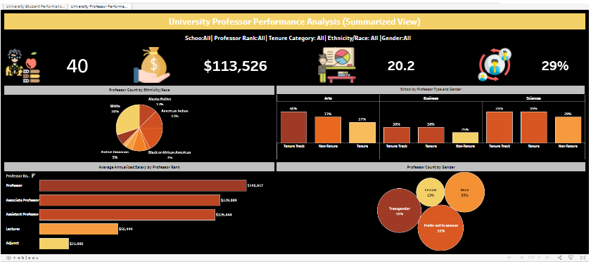
Performance Analysis

To showcase your departments metrics or track performance of your students.

WHO: School Deans or Program Coordinators

WHAT: Snapshot of department’s performance metrics

WHY: Track metrics to identify potential gaps and address issues before they arise

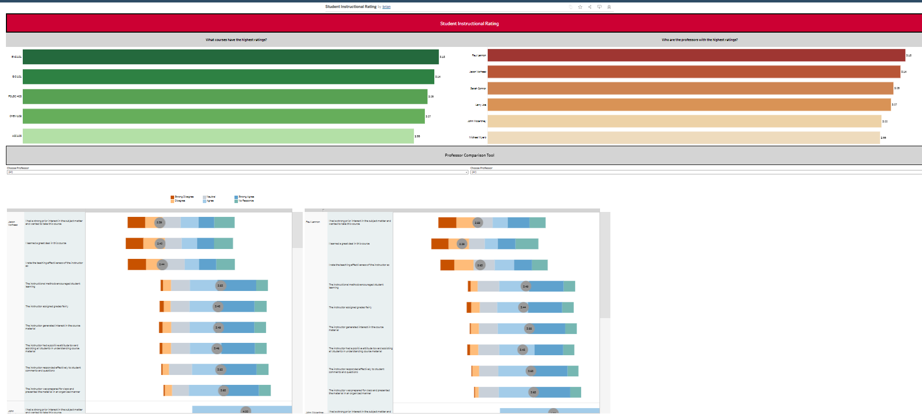
Course Comparison Tool

In this example we are showing ways to represent survey data. This data is only for demonstration purposes.

WHO: Department coordinators or students

WHAT: Student Instructional Rating Survey results

WHY: Better inform our coordinators on their departments and help students gain insight into their course experience 

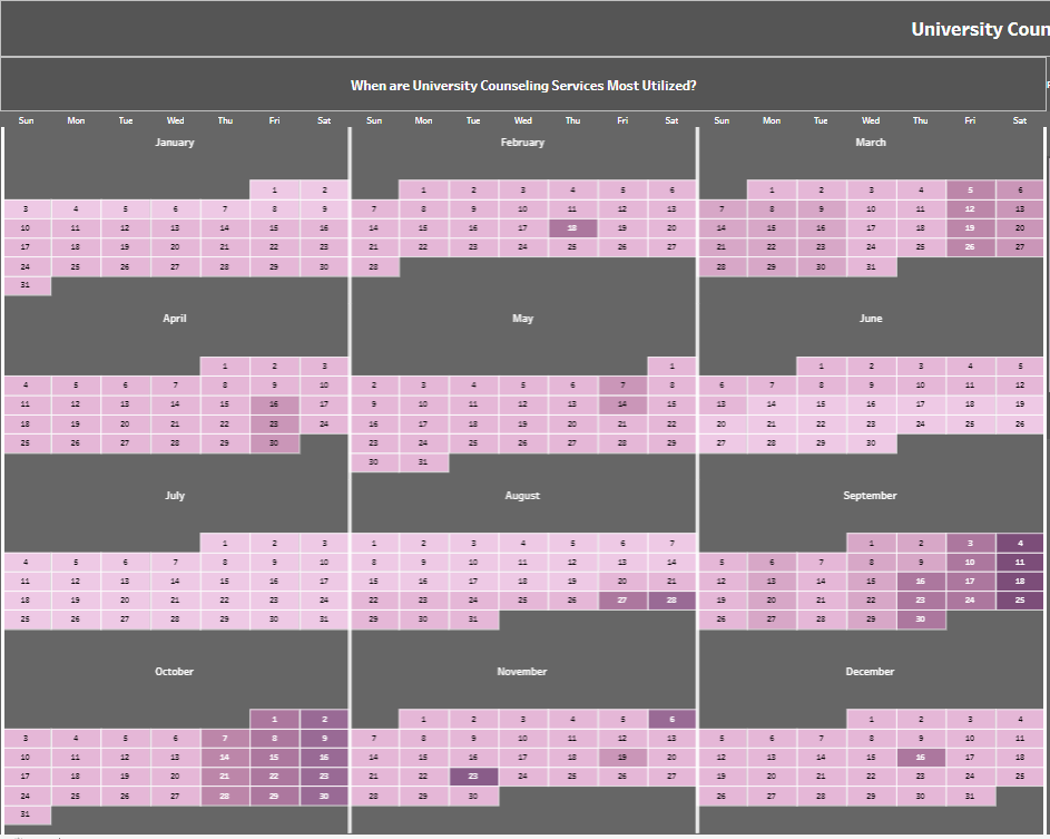
Mental Health in Higher Ed

This example is utilizing a heat map to show the use of mental health services that many universities provide. Application for this dashboard can be applied to several contexts here at Rutgers.

WHO: Counseling Center Leadership

WHAT: Heat map and demographic charts

WHY: Capacity Planning & Tracking Demographic Trends

We’ll be featuring more dashboard examples on this page, please check back with us!


To learn about enterprise analytics tools, please check out BI Tools