Data Tools
To support our work and help our many stakeholders, the Hidden Innovation Infrastructure NSF ATE project team has developed two “Data Tools”. These data visualization tools can quickly provide a “picture” of data trends in workforce education. Paired with an understanding of national, state and/or regional economic background, these tools provide support for college program planning, workforce data research, and workforce projections.
Evolution of Technician Employment in Manufacturing, 2004 – 2021
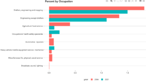
This tool presents evolution of the employment in all manufacturing occupations from 2004 to 2021. The app allows users to generate a graph of the summary (high level categories) or by details with the substructure of the SOC code. The user can look at the data for the whole country, as total employment, percentage or percent change. Alternatively, a user can select a specific Metropolitan Statistical Area (MSA) and display the employment change between 2004 and 2021 by occupation or with the line items (subcategories).
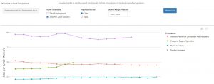
Track technician graduates by state or nationally
This tool allows users to explore the number of graduates of technician program between 1995 and 2021 by field of study within a state and nationally. The app has been built to also allow users to compare the number of technician program graduates (i) across different programs within a state, (ii) within the same program across states, and (iii) nationally. Based on user feedback, we created the app such that users can disaggregate the results by degree level. In other words, users are able to view the number of graduates per program and state by type of degree (e.g., less than one year degree, Associates degree, etc.). A toggle allows users to visualize the results of their data selections as either a chart with interactive tooltips that include further detail, or as a table. Additional functionality allows users to download the charts they produce as png image files and to download the table of data that they create as an Excel file. Users are also able to download the entire data set that drives the app.
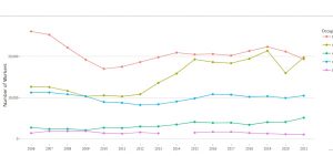
Track technician occupational trends by state or nationally
This tool presents employment trends in technician occupations from 2004 to 2021. Similar to the technician graduates app, the technician occupational demand app allows users to compare the number of technician workers (i) across different occupations within one state, (ii) within one occupation across states, and (iii) nationally. The occupation app also allows users to summarize total employment across multiple occupations that are very similar (e.g., CNC Machine Tool Operators and CNC Machine Tool Programmers) and compare these totals across states that are, for example, part of the same labor market (e.g., Massachusetts and Connecticut), or are similar in population (e.g., Pennsylvania and Illinois). When users hover over a point in the chart, a tooltip displays key information about the occupation: (i) number employed; (ii) median earnings; (iii) range of earrings (25th to 75th percentile); and (iv) number of jobs per 1,000 workers in the state, which allows for easier cross-state comparisons. The app also allows the user to toggle between visualizing the trends by number employed or by jobs per 1,000 workers.