Books from the former Rare Book Collection of the Center of Alcohol Studies Library shelved at Annex.
Is it scholarly? Librarians often receive this question from students trying to orient themselves while navigating the maze of articles from scholarly and popular publications they need to cite when their paper is due. It’s a valid question, since it’s sometimes difficult for the novice to decide from a text alone, especially in an unfamiliar field.
Before the Internet era, physical items such as book jackets cover pages of journals and magazines were extremely helpful in determining scholarly bent, as they made a rather clear distinction without even reading a sentence. Popular magazines with their flashy front page, editorializing headlines, and eye-catching images can be seen by today’s students mostly at the grocery store check-out (unless they buy groceries online too). Scholarly articles are downloaded without ever seeing the title page of the journal. Students no longer have the chance to pay attention to book covers either. Perhaps the recreational reading collection is the only place where they can realize how dust jackets capture their attention, albeit often in a commercialized manner.
Working with books and journals in hand – that is, looking at physical items closely in the Alcohol Archive – reminded me of all this. However, I’m not sure if was any different in the past. Technology, or the lack of high-tech solutions in the publishing industry, can be blamed for that too.
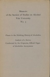
 The first publications of the Center of Alcohol Studies can well illustrate this. Most of the series launched in 1940s seem to have an identical feel with their plain designs typical of scholarly publications, even though some were addressing lay people such as the Lay Supplements.
With its choice of font types and design, the simple black-on-gray cover page of the Memoirs series promises and delivers scholarly content.
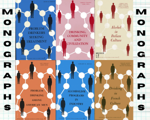
It was not until the publication of the Monograph Series started at the end of the 1950s at Yale (and continued at the Rutgers Center of Alcohol Studies after the move in 1962) that the publications division came up with a still simple, yet eye-catching design for covers. A single color background with large white dots linked to each other made the series stand out on the shelves.
Another example is the popular Pamphlet Series published in the late 1980s and early 1990s at Rutgers on contemporary issues related to Alcohol Studies. Although geared toward diverse audiences, these reserved a solemn, unified look as the authors included renowned scholars, educators, professors, and other experts from a variety of areas.
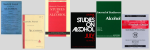
The Quarterly Journal of Studies on Alcohol shows a similar progression from the simple, blue cover with the table of contents printed on the front cover in the 1940s to its contemporary version, now published as the Journal of Studies on Alcohol and Drugs, featuring a shiny cover, featuring a subtle image of the iconic the Rutgers Center of Alcohol Studies bridge and more relevant content on the back and inside covers.
What did we learn from this, other than missing a hint about the content of a book or journal? I am not sure yet. However, a great fan of audiobooks, I better pay more attention to book jackets for pleasure reading too. I may as well get some pointers right away!


