
I recently returned from a trip to the rare books reading room at Princeton, and thought it was high time to collect a few thoughts about some of the things I’ve found. Most of the posts here cover my labor to reconstruct the craft practices of the marbled page in Sterne’s Tristram Shandy. But I’ve been making a point of looking at other things, too, including the “black” pages that appeared in the first volume of Sterne’s novel. I’m not planning a reconstruction. The collective at 39 Steps Press has already done that, as an experiment in contingency and the limits of a wrought-iron letterpress. Also of interest is the collection of pages commissioned by the Sterne Trust, every one black or inspired by Sterne’s blackness. But because the black page, like the marbled one, is a relic of craft practices, I’ve spent some time thinking about the press and the affordances of ink. [EDIT: And in the year since I originally wrote this up, I have indeed done a sort of reconstruction: see below.]

Sterne himself was the first to draw the comparison between the black page and his motley emblem, on the page immediately preceding the marbled leaf. “Without… much knowledge,” Sterne’s narrator warns,
you will no more be able to penetrate the moral of the next marbled page (motly emblem of my work!) than the world with all its sagacity has been able to unraval the many opinions, transactions and truths which still lie mystically hid under the dark veil of the black one.
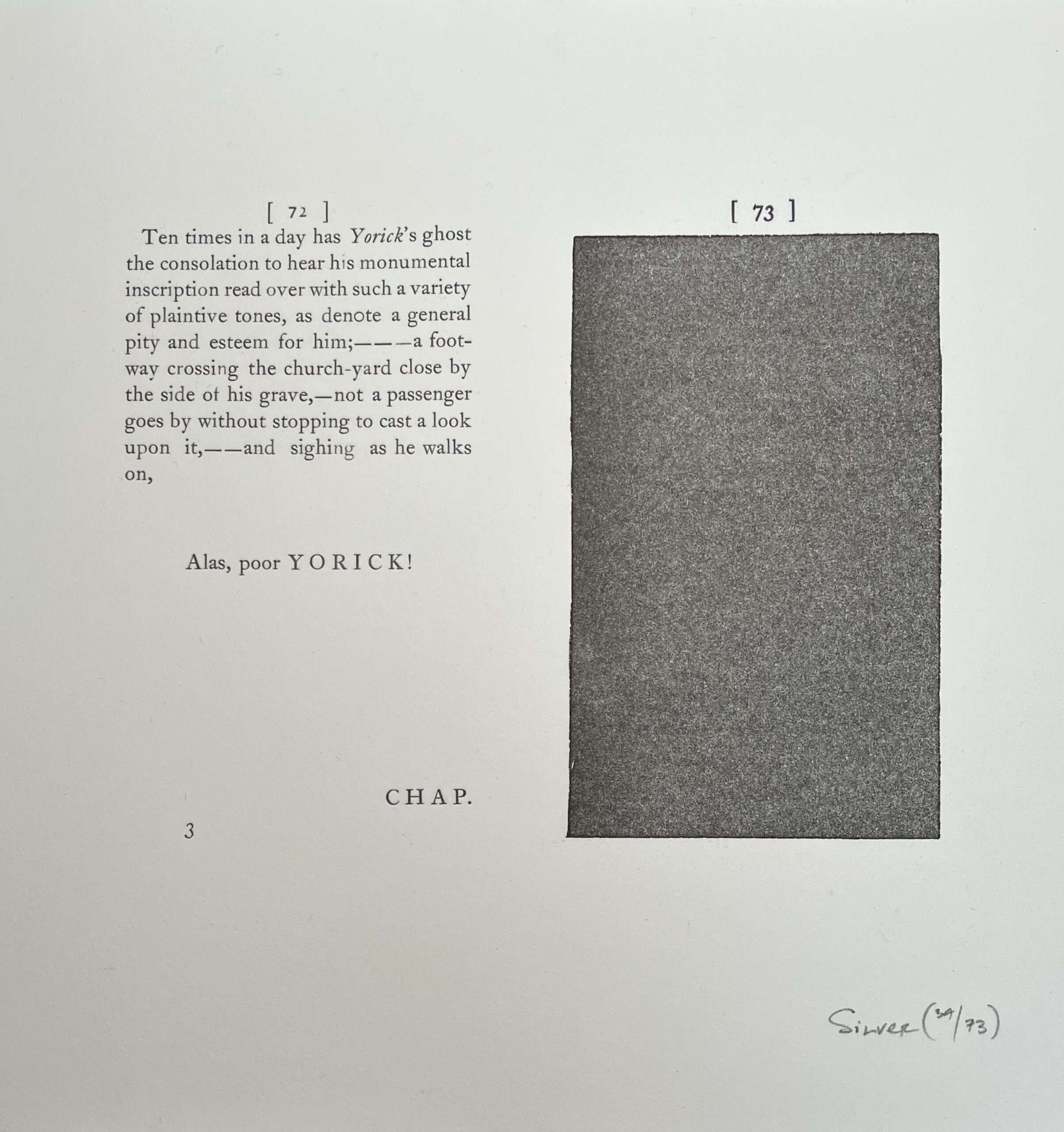
Like the marbled leaf, the margins of the black one are preserved. It is paginated. It is only that it is blacked, entirely, with the same printer’s ink that appears in the rest of the book. This means that (unlike Sterne’s marbled page), the black page was made in-house, by the same printer who set the type on the rest of the gathering. For the 1st edition of the first volumes of Tristram Shandy, this was Ann Ward, printer in Sterne’s native city of York; for my copy, it was Robert Dodsley’s pressmen.

If a review of the literature is any guide, Sterne’s black page is more shocking to modern readers than the marbled one. It follows Sterne’s description of the death of Yorick, the clergyman who was Sterne’s alter ego. “Alas, Poor Yorick,” the prior page proclaims, halfway between plangency and the mock epic. Then, the yawning gulph, like a funeral pall. That plangent blackness, a kind of overdetermination by underexpression, was fruitful matter for structuralist and post-structuralist alike, for whom these sorts of paradoxes and games of difference were wonderfully generative. That midcentury tradition on Sterne’s page is compactly summarized by Anastasia Eccles in a recent essay in New Literary History; in “the two black pages that follow Yorick’s death,” she writes, “formal experiment and sentimental elegy coincide in a negation of writing that is also a graphic approximation of a headstone.” The end of writing is death, and it is the author’s role to stave it off; so Tristram Shandy himself, after Death has knocked on his door, keeps writing the following volumes in order to outrace him. From this perspective, it would be interesting to know if more ink were used in the making of the first editions of Sterne’s black pages, or in the critical commentary that has followed.

The black page has been celebrated by modern readers as one of Sterne’s strange and quirky formal innovations, harnessing the native materials of the printer’s shop to render death on the page. But the page would not have been particularly surprising to the eyes of eighteenth-century readers. Though black emblems like Sterne’s were mostly déclassé by the time his printer was setting type in form, they were a common enough features in seventeenth-century hagiographic texts and sermons upon funereal occasions that examples are easy to find– especially with the advantage of digital databases. Black was the color of death in life, and also in print. So black is the color of funeral weeds, and the mortcloth or pall covering a body, and also rings, sword-hilts, fans, and bonnets associated with death. It is the color of the borders on so-called “bereavement stationery,” like calling cards and letters sent to announce a funeral. And it repeatedly shows up in elegiac writing of all sorts. So, an anonymous author laments the untimely death of Spencer, Earle of Northampton (1643), and there follows a page, entirely black.

Abraham Darcie erects a “monumentall pyramide” to remember Lodowick, late Duke of Richmond,” and one whole verso leaf appears in mourning.

John Taylor eulogizes Henry, Prince of Wales—”Lament. Heu heu, mortuis Lachrymae non prosunt“: alas (he writes), tears won’t help the dead; “Great Britaine” is “all in black for the incomparable losse,” and the book is too: two different full pages, lavishly all in black.
So, “Alas, Poor Yorick!,” writes Tristram for the death of his friend, once so full of life. He commemorates the solemn occasion in the traditional way: with a page dressed in black.
This tradition hasn’t gone unremarked. A careful reader of footnotes will find the thread of a critical tradition. Melvin New, in the notes to the Florida edition of Tristram Shandy (1985), points to a few imperfect examples, including one noted by Wilbur Cross in his prior Life of Sterne, and offers a “suspicion” that these form the substance of Sterne’s allusion. Diana Patterson identifies a more perfect specimen, in John Quarles’s Regale Lectum Miseriae (London, 1649), an elegy upon the death of King Charles (See Patterson, The Next Marbled Page, 102). And, most recently, Whitney Trettien, while completing a dissertation on seventeenth-century experiments in typography, independently constructed a similar collection of instances, nicely concluding that Sterne’s use of the emblem offers an elegy for an abandoned tradition: “a memorial to an earlier time.”

So the page wasn’t particularly experimental. But calling it “the black one”: that’s also a misnomer, and not only because it isn’t black, except inasmuch as it comes from black ink. Of the copies issued from Ann Ward’s shop, I’ve seen about thirty, or sixty, if you count both sides, and can confidently report that no two are the same. Like everything else in Tristram Shandy‘s celebration of life, death too is radically contingent. In one, a flaw in the ink has left a little arrow to nowhere. And, in another, a tiny protein fiber, perhaps a single strand of wool, or maybe the hair of someone working in the printer’s shop, has interposed itself between plate and page, leaving its contingent mark.

Thinking about how that fiber got there—the long-haired sheep from which it was shorn, say, the woolen it was woven into, the garment into which it was sewn, and finally the body from which it dropped—is to summon up exactly the kind of game that Sterne delighted in, so much so that one of the best-known images from the book visually replicates it, to similar effect. This is Trim’s “line of freedom,” the Brownian motion of the bachelor’s prerogative to twist and turn with his own nature: or, one long Lucretian swerve. And it is also like Shandy’s somewhat less famous attempts visually to render the plots of each of his books—which, too, are lines made to twist and contort with the contingency of contingent things. So, in one sense, Sterne’s black page clearly represents the finality of death as the closure of speech. But, in another, each copy also anticipates Sterne’s later meditations on difference and contingency, especially as timeless things are made to fall into and out of print.
CODA: Cy Twombly’s Blackboards

For what it’s worth, and by way of a coda, what I see when I look at the black page are Cy Twombly’s blackboard paintings. These were the images, some as large as twenty feet in length, that cause oils (and sometimes wax) to resemble the sort of slate writing surfaces formerly found at the head of every classroom, which, through days or weeks of use, would acquire a thick patina of multiply erased, tantalizingly illegible scrawls in chalk. I suppose these, too, will require critical commentary to be explained as part of an obsolete technology—or else simply be regarded as instances of Twombly’s formal experimentation with paint. But where Twombly introduced layers of orphic marks with various contraptions and improvised methods to obtain continuous lines (the caption at MoMA claims that he rode on a friend’s shoulders who scuttled along, crab-like, while Twombly scrawled his continuous lines), the artisans responsible for Sterne’s black page achieved remarkably similar effects– unintentionally, I suppose– just through the properties at the interface of paper, woodblock, and ink. This is one instance of what Robert Boyle remarks, in his thoughts on artisanal knowledge, of the way that what appears painstakingly to have been done can in fact be achieved just through a knowledge of materials.

A similar paradox of silence and speech surrounds Cy Twombly’s chalkboard paintings, which contain no words, but have been the subject of numerous captions, notes, articles, and interviews. Though no word appears in Twombly’s images, these mural-like paintings have nevertheless been lavished with countless critical and curatorial remarks. Mary Jacobus for instance compares Twombly’s chalkboard paintings to his own habits in speech: the way his sentences, when he spoke, trailed off into silence, or how he edited and corrected himself mid-sentence, or the way he would immediately negate things he had just said. These, Jacobus argues over 250 tightly reasoned pages, are the verbal equivalent to the kinds of erasures Twombly perfected in visual media, and vice versa, such that the old equivalence between the sister arts (“poetry is a speaking picture; painting, a silent poem”) here turns up in a surprising way, and silence, all around, gives belated way to a profusion of print.
CODA to the CODA:
Being the unrepentant tinkerer that I am, I recently set a version of the black page as part of a project in the letterpress studio. I have been reconstructing idealized versions of some of the most interesting pages from Sterne’s Tristram Shandy. My goal is partly to understand Sterne’s novel, and partly the letterpress practices which he exploited for literary and rhetorical effect. A photograph appears below. The ghosts of two people are memorialized, here: Yorick, Sterne’s alter ego, and Robert Dodsley’s most trusted pressman, whose number “3” was.