Feature Tabs
The Feature Tabs module is a layout tool that adds to a page interactive tabs that display different sets of content when clicked.
Appearance On The Site
This module appears as a bold, centered header above a rectangular container with a set of one or more clickable tabs. Clicking any of these tabs will display the content assigned to that particular tab.
The first of these tabs will be displayed by default until another tab is clicked. Each tab can also be assigned a unique background image to be displayed behind its content.
Sample Feature Tab Header
Lorem ipsum dolor sit amet, consectetur adipiscing elit, sed do eiusmod tempor incididunt ut labore et dolore magna aliqua. Ut enim ad minim veniam, quis nostrud exercitation ullamco laboris nisi ut aliquip ex ea commodo consequat. Duis aute irure dolor in reprehenderit in voluptate velit esse cillum dolore eu fugiat nulla pariatur. Excepteur sint occaecat cupidatat non proident, sunt in culpa qui officia deserunt mollit anim id est laborum.
Lorem ipsum dolor sit amet, consectetur adipiscing elit, sed do eiusmod tempor incididunt ut labore et dolore magna aliqua. Ut enim ad minim veniam, quis nostrud exercitation ullamco laboris nisi ut aliquip ex ea commodo consequat. Duis aute irure dolor in reprehenderit in voluptate velit esse cillum dolore eu fugiat nulla pariatur. Excepteur sint occaecat cupidatat non proident, sunt in culpa qui officia deserunt mollit anim id est laborum.
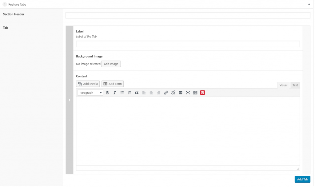
Content Builder Control
The Section Header field will center any input in bold text above the Feature Tab module.
Inputting text into the Label field will display it as the title of that particular tab.
The tab’s Background Image can be configured by adding an image from your site’s Media Library. For best results, this image should be no smaller than 715 x 500.
Under Content you can add any text and media you’d like to be displayed in the tab using a standard WYSIWYG editor. This text is superimposed over an transparent black background to increase readability.
You can add more tabs to the module as needed by clicking the Add Tab button.
Video Tutorial