Front Page
As your site’s homepage, the Front Page is unique in both design and format to quickly grab user attention.
While its creation and editing processes are the same as those for Interior Pages, the Front Page also offers the Slider, a highly customizable banner area that you can alter to your liking.
Slider
The Slider is a banner-like area on your site’s front page that rotates through multiple slides of content using a sliding animation.
It can be edited under the Header Banners section of the Front Page’s page editor.
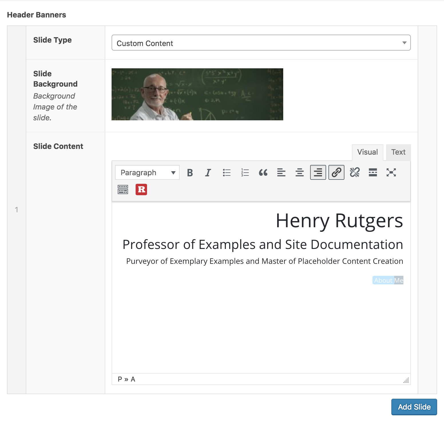
Keep in mind that the content you add to this section will only display in the Slider, and nowhere else on the Front Page.
The slider can be as simple or complex as you’d like. Adding only one slide will render it as a static banner with no sliding animation, while adding multiple slides will make it automatically rotate.
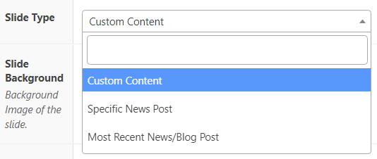
A slide can contain many different types of content, which you can configure using the “Slide Type” dropdown.
Custom Content
The Custom Content slide type offers all the standard functions of a WYSIWYG visual text editor. You can add headers, formatted text, Rutgers-styled buttons, and much more to a slide using this slide type.
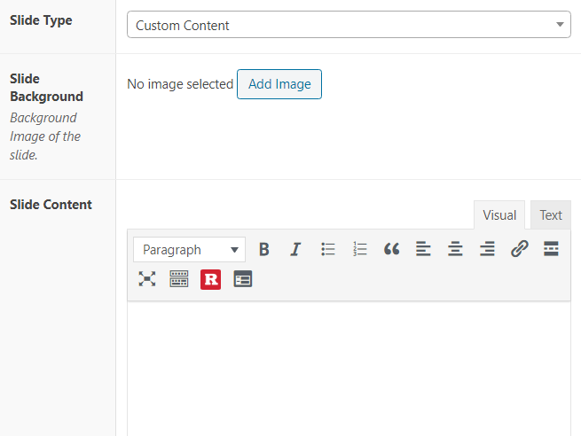
You can also select a Slide Background Image that will appear behind your text area. For best results, this image should be no smaller than 1706 x 500 – otherwise the display will be stretched.

Specific Post
The Specific Post slide type allows you to display in the Slider the title and summary of any post on your site.
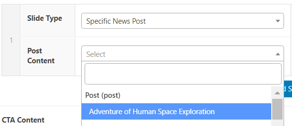
This slide’s background image is determined by the displayed post’s featured image, which can be configured using the Featured Image module on that post’s page editor.
Most Recent Post
The Most Recent Post slide type is much like the Specific Post slide type, but with one key difference: it will always display your site’s most recently published post.
The contents of this slide will automatically update whenever you publish a new post.

As with the Specific Post slide type, the background image will depend on the featured image that has been assigned to that post.

Video Tutorial
Call-to-Action Bar
The Call-to-Action Bar is a gray area below the slider intended for displaying important information you’d like visitors to see or act upon – hence the name “Call-to-Action”.

There are two elements to the CTA Bar – CTA Content and the CTA Button.
CTA Content displays in the body of the CTA Bar and is configured using a standard WYSIWYG editor. This is where you’ll want to put any announcements or updates about your site.
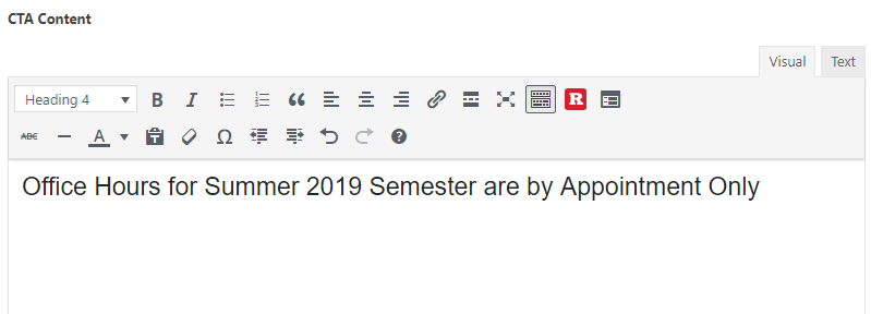
The CTA Button is a button that displays next to the CTA Content that is configured by inputting a label and link.

Linking this button to a page that expands upon your CTA Content is a great way to use the CTA Bar.
To remove the Call-to-Action Bar, simply leave both the CTA Content and the CTA Button fields empty.
Video Tutorial
Sidebar
The process of adding or removing a sidebar is slightly different on the front page due to its unique layout.
Instead of using the dropdown in the “Page Attributes” module, sidebar display is configured in the Front Page Settings section of the page editor, right above the Slider configuration options.
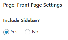
Simply check the “Yes” or “No” radio button to add or remove a sidebar from the front page.
Additional Content
Though the front page’s page editor focuses primarily on the Slider and CTA Bar, you can still add additional content below the front page slider using Flexible Content Builder Modules, just as you would on any other page.
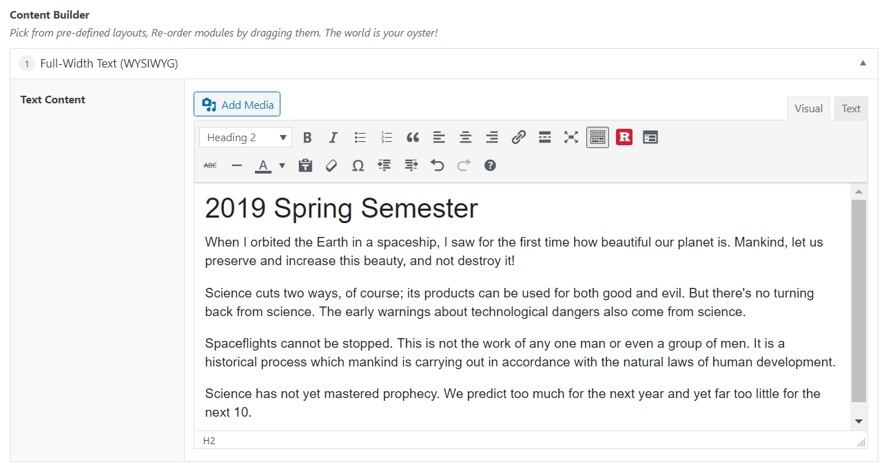

This content will display below the Call-to-Action Bar, and next to the sidebar if one has been added.
